LinkedIn Ads Benchmarks
Benchmarks show how your LinkedIn Ads performance compares to other companies running LinkedIn Ads through Fibbler. Instead of guessing whether a 0.45% CTR or a $40 cost per reached company is good, you can see exactly where you land against peers who spend at the same level you do.
Benchmarks are available on the Unlimited and Agency plans.
What gets benchmarked
Fibbler benchmarks seven LinkedIn-native metrics. Each one is calculated from the same identified-company data that powers the rest of Fibbler, so the numbers match what you see across Company Insights and Campaign Analytics.
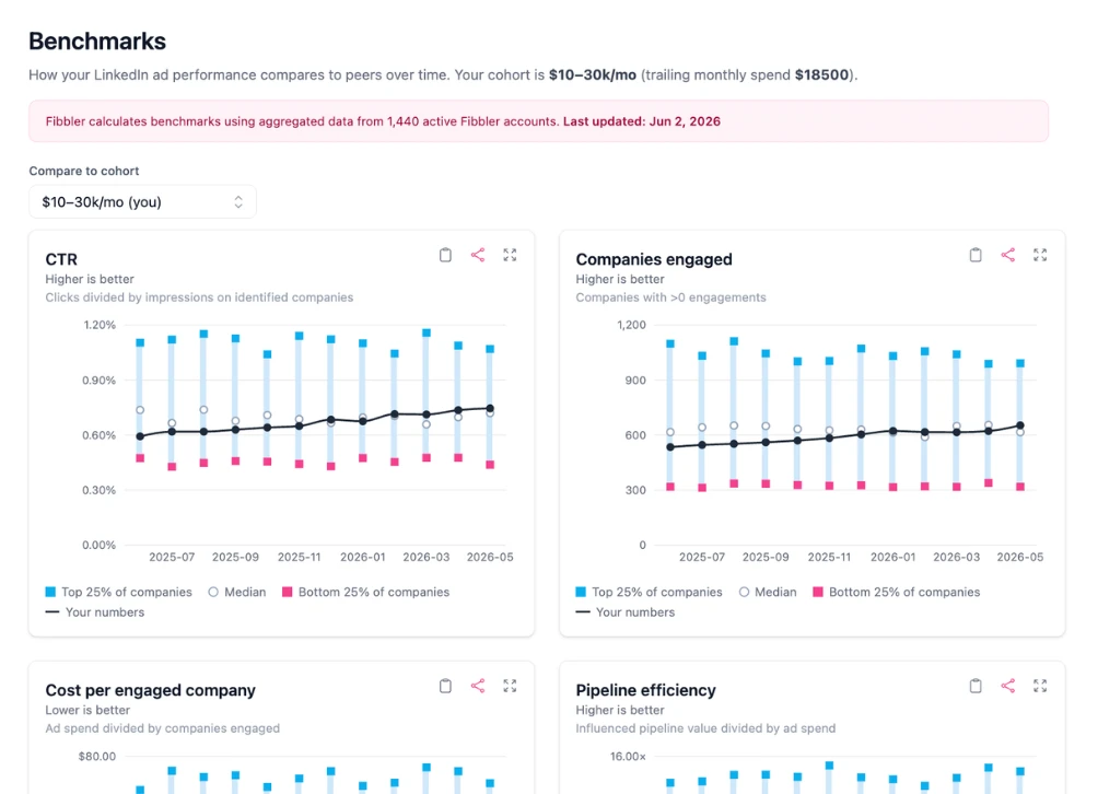
- CTR clicks divided by impressions on identified companies
- Companies reached companies with more than zero impressions
- Cost per reached company ad spend divided by companies reached
- Companies engaged companies with more than zero engagements
- Cost per engaged company ad spend divided by companies engaged
- Pipeline efficiency influenced pipeline value divided by ad spend
- Return on ad spend influenced revenue value divided by ad spend
Spend cohorts
A company spending $5k a month should not be measured against one spending $80k a month. The economics of reach, cost, and pipeline are completely different. So Fibbler splits accounts into four spend cohorts based on trailing monthly spend:
- Small under $10k per month
- Mid $10k to $20k per month
- Large $20k to $50k per month
- Extra large $50k+ per month
Your account is assigned to a cohort automatically based on your spend, and the chart defaults to comparing you against your own cohort. You can switch the comparison to any other cohort from the dropdown to see how performance shifts at different spend levels.
Reading the chart
Each metric is shown as a chart with two layers. The shaded band is the peer cohort, drawn between the bottom quartile and the top quartile, with the median marked in the middle. Your own monthly values are plotted as a line on top, so you can see both where you sit relative to peers and how you are trending month over month.
- Top quartile the best 25% of accounts in the cohort for that metric
- Median the middle of the cohort
- Bottom quartile the lower 25% of accounts in the cohort
"Top" always means good, regardless of the metric. For metrics where higher is better (CTR, companies reached, companies engaged, pipeline efficiency, and return on ad spend) the top quartile is the high end. For cost metrics where lower is better (cost per reached company and cost per engaged company) the top quartile is the low-cost end. You never have to remember which direction is good for each metric.
You can expand any chart to a fullscreen view, and download or copy it as an image for sharing in reports and presentations.
How benchmarks are calculated
For each cohort, metric, and month, Fibbler computes the 25th, 50th, and 75th percentiles across all eligible accounts. The current month is excluded until it closes, so you are never comparing against partial data.
All cohort bands are normalized to USD so peers in different currencies can be compared fairly. Your own cost values are shown in your account's home currency, with a note on the chart explaining this. When a cohort has too few accounts in a given month to produce a reliable band, the chart flags it as a low-sample comparison.
Privacy
Benchmarks are fully aggregated and anonymous. You only ever see the cohort percentile bands, never any individual company's numbers, and no other company can see yours. The size of the benchmark pool is shown rounded so the underlying accounts stay anonymous.
Requirements
To see benchmarks, you need:
- An Unlimited or Agency plan
- A connected LinkedIn Ads data source
- At least one full calendar month of LinkedIn ad data
- A connected CRM (HubSpot, Salesforce, Pipedrive, or Attio) for the pipeline efficiency and return on ad spend metrics